
Plain captures. Forgettable listing.
Screenshots are the first thing a shopper sees and the biggest lever on installs — and the part most makers ship raw, because doing it properly means a designer, a spec sheet and a week.
Designers are slow & pricey
A polished set costs hundreds and takes days of back-and-forth before you can submit.
Store specs are a maze
Every device and store demands exact pixel dimensions. One wrong size and the upload is rejected.
Every size, again
iPhone, iPad, Android phone, tablet, feature graphic — redrawing the same design per canvas is the whole afternoon.
Real device frames, not rounded rectangles
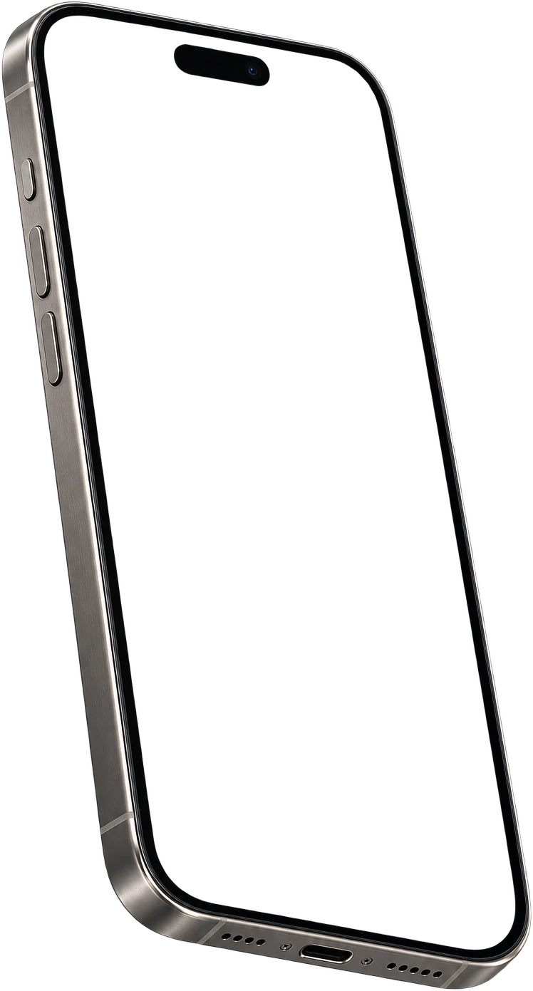
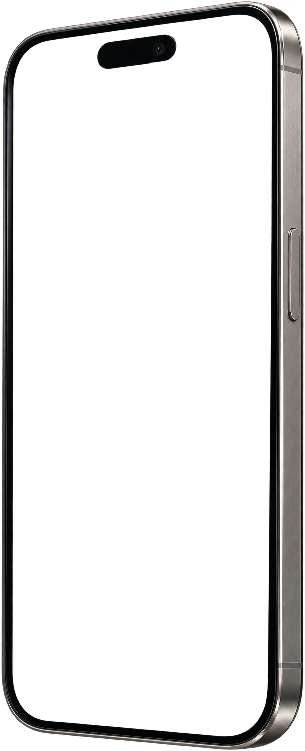
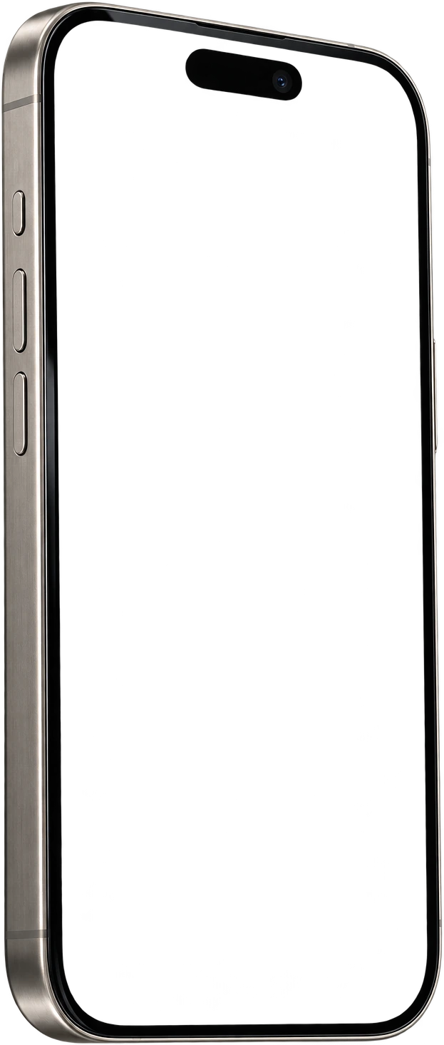
A screenshot reads as a real app when the phone around it reads as a real phone. The editor ships photoreal, transparent-PNG frames — flat straight-on bodies for iPhone, iPad, Android phone and tablet, Apple Watch, Wear OS, MacBook and iMac, plus angled 3D poses for iPhone and Android.
- ✓Flat, floating, laying, tilted and in-hand poses
- ✓The frame is shaped to your capture’s aspect ratio, so nothing is cropped off the top or bottom
- ✓No app header hidden behind a Dynamic Island — the detail most mockup tools get wrong
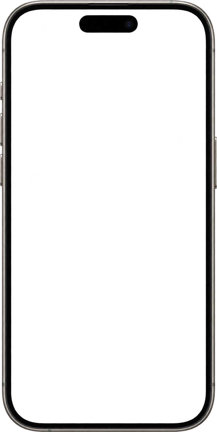
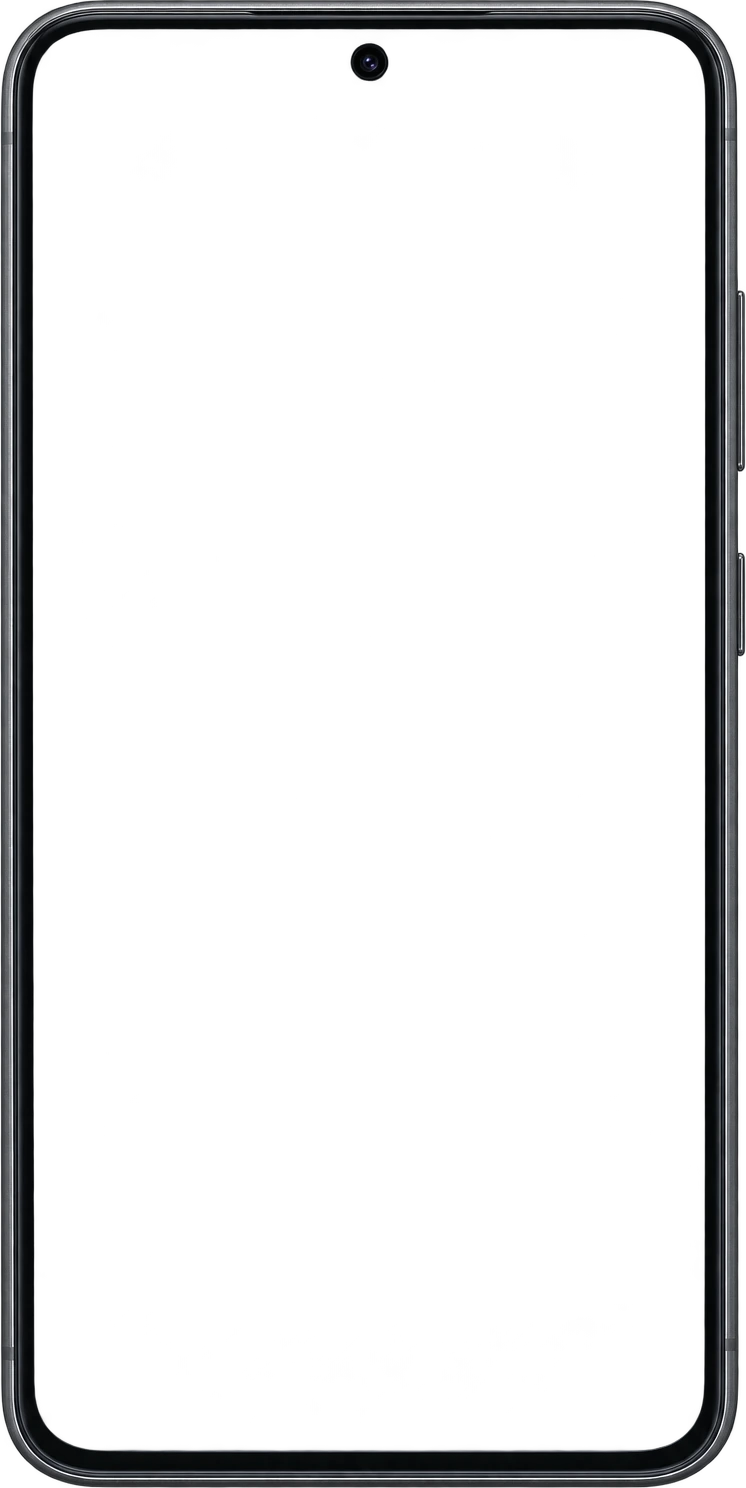
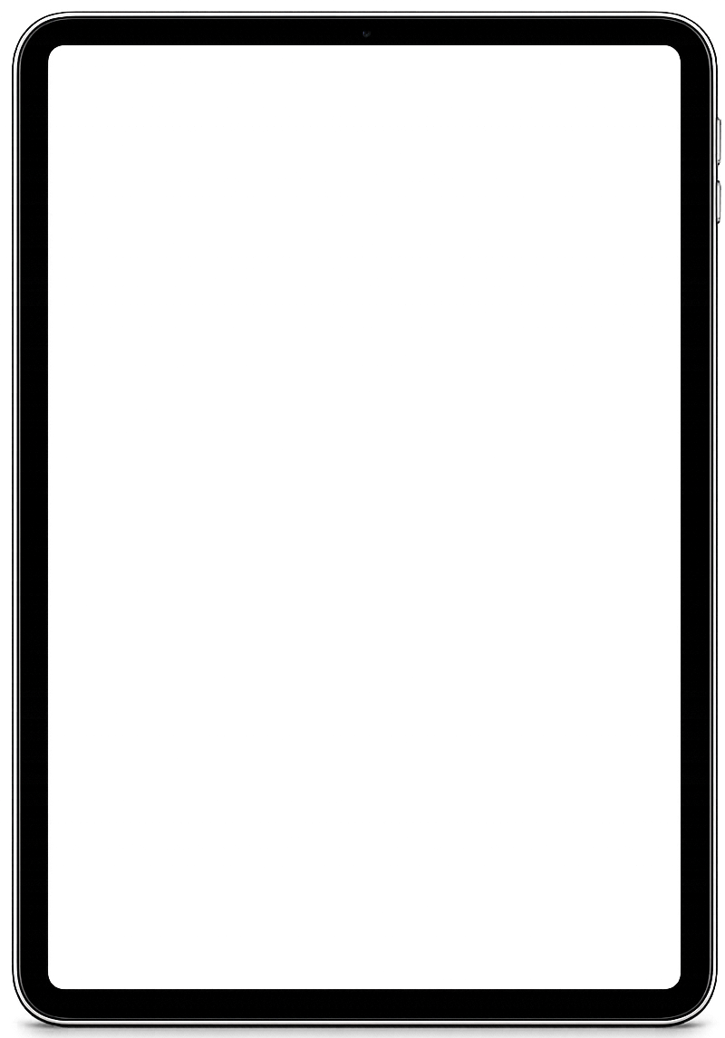
push
Start from a template, not a blank canvas
Pick a layout from the gallery and your captures drop straight in. Backgrounds, headline type with real webfonts, shapes and a procedural element library are all there when you want to diverge from it.
- ✓140+ hand-built layouts in the template gallery
- ✓One page, every screen — the whole set sits side by side in a filmstrip
- ✓Design the sequence a shopper actually swipes through, not one frame at a time
Every size the stores ask for
Apple now requires only the largest display in each family and scales the rest down itself, so an iPhone app needs one 6.9-inch set and an iPad app one 13-inch set. Both are one click here, and the export names every file in upload order.
| Device | Size | Pixels (portrait) | Status |
|---|---|---|---|
| iPhone | 6.9″ | 1320 × 2868 | Required |
| iPad | 13″ | 2064 × 2752 | Required if iPad-supported |
| iPhone | 6.7″ / 6.5″ / 5.5″ | 1290 × 2796 / 1284 × 2778 / 1242 × 2208 | Optional legacy sets |
| Apple Watch | Series / Ultra | 416 × 496 / 410 × 502 | If you ship a watch app |
| Mac | Mac App Store | 2880 × 1800 | If you ship a Mac app |
From raw captures to store-ready
- 01
Create a project
Pick iOS, Android or both and the devices you ship to.
- 02
Drop in your screens
Place each capture in a device frame, or start from a template.
- 03
Caption and style
Headline type, gradients, backgrounds and shapes — across the whole set at once.
- 04
Export the ZIP
Every frame at its exact store resolution, named in upload order, no watermark.
A canvas built for store specs
Including Free. The free plan is limited by project count, not by branding on your work.
Add a size and apply the same template — artwork is rescaled to the new resolution rather than redrawn.
Generate a locale variant that keeps the layout and swaps only the caption — see listing localisation.
Your screens, logos and stock imagery live in a project library instead of being re-uploaded per frame.
Screenshots are only part of a submission
The store also asks for listing copy, a privacy policy at a public URL and, in practice, a website. Those are in the same studio: AI listing metadata, hosted privacy and terms, an app landing page and smart links — see the whole Edok Studio app launch kit.